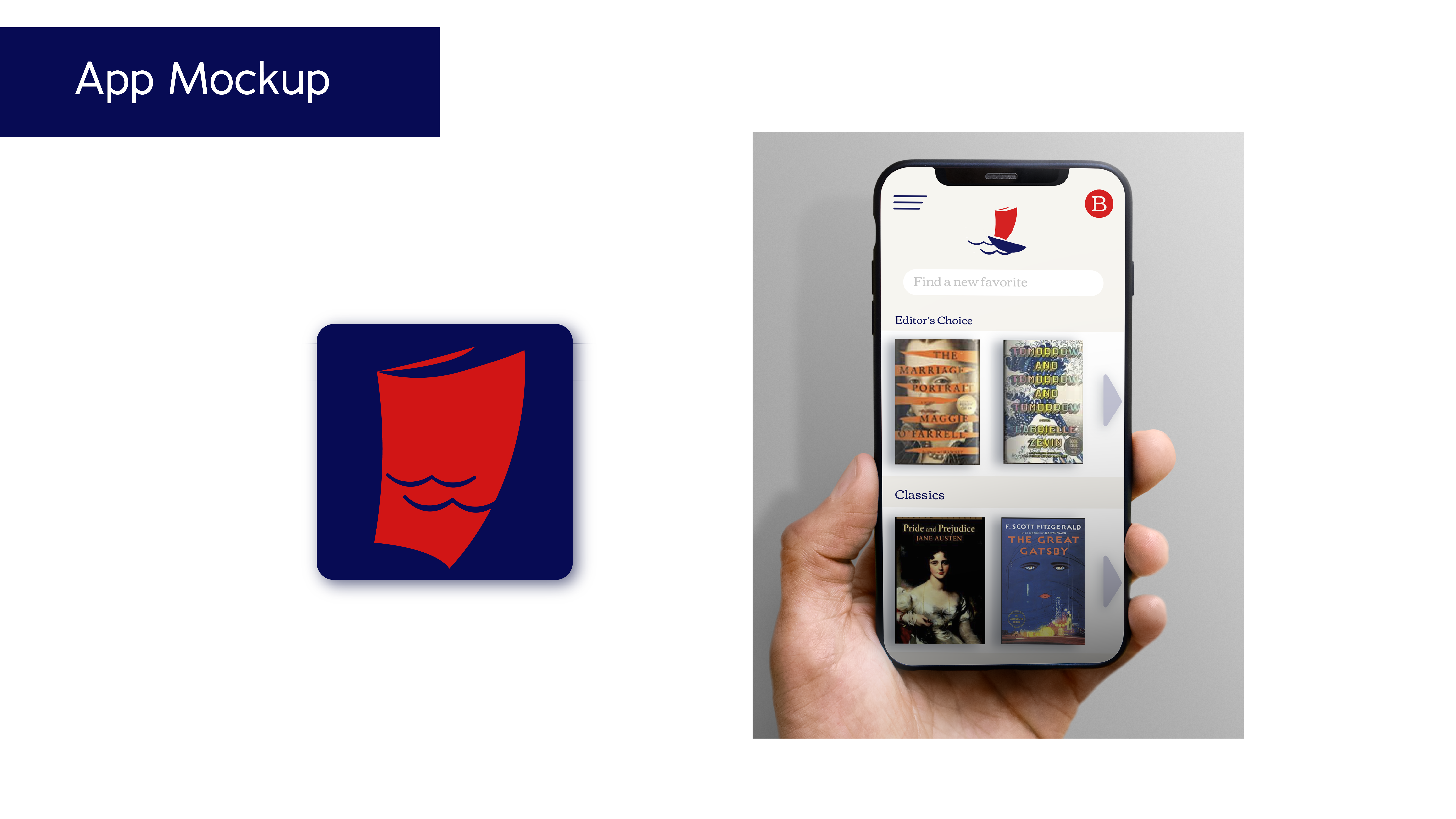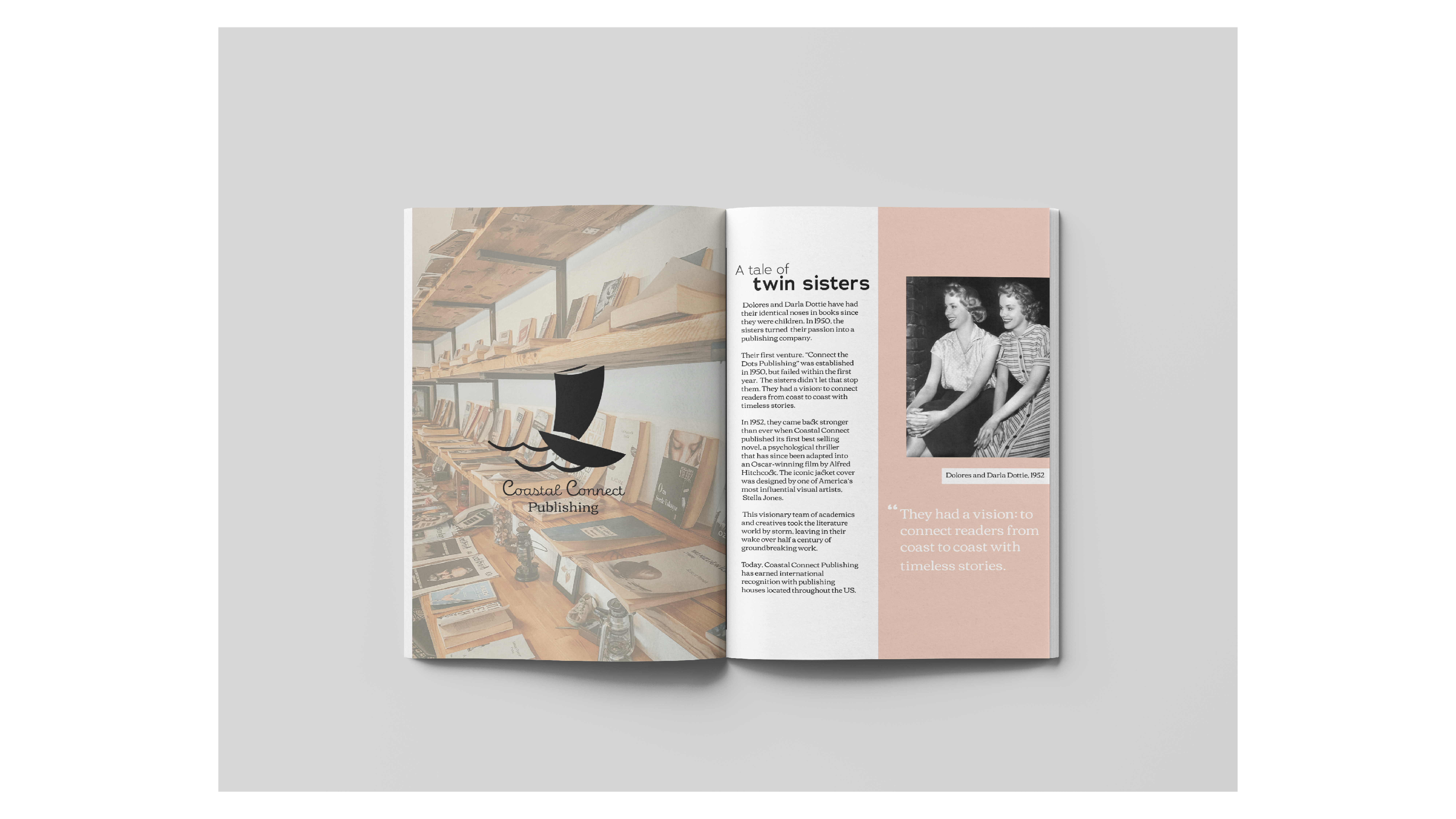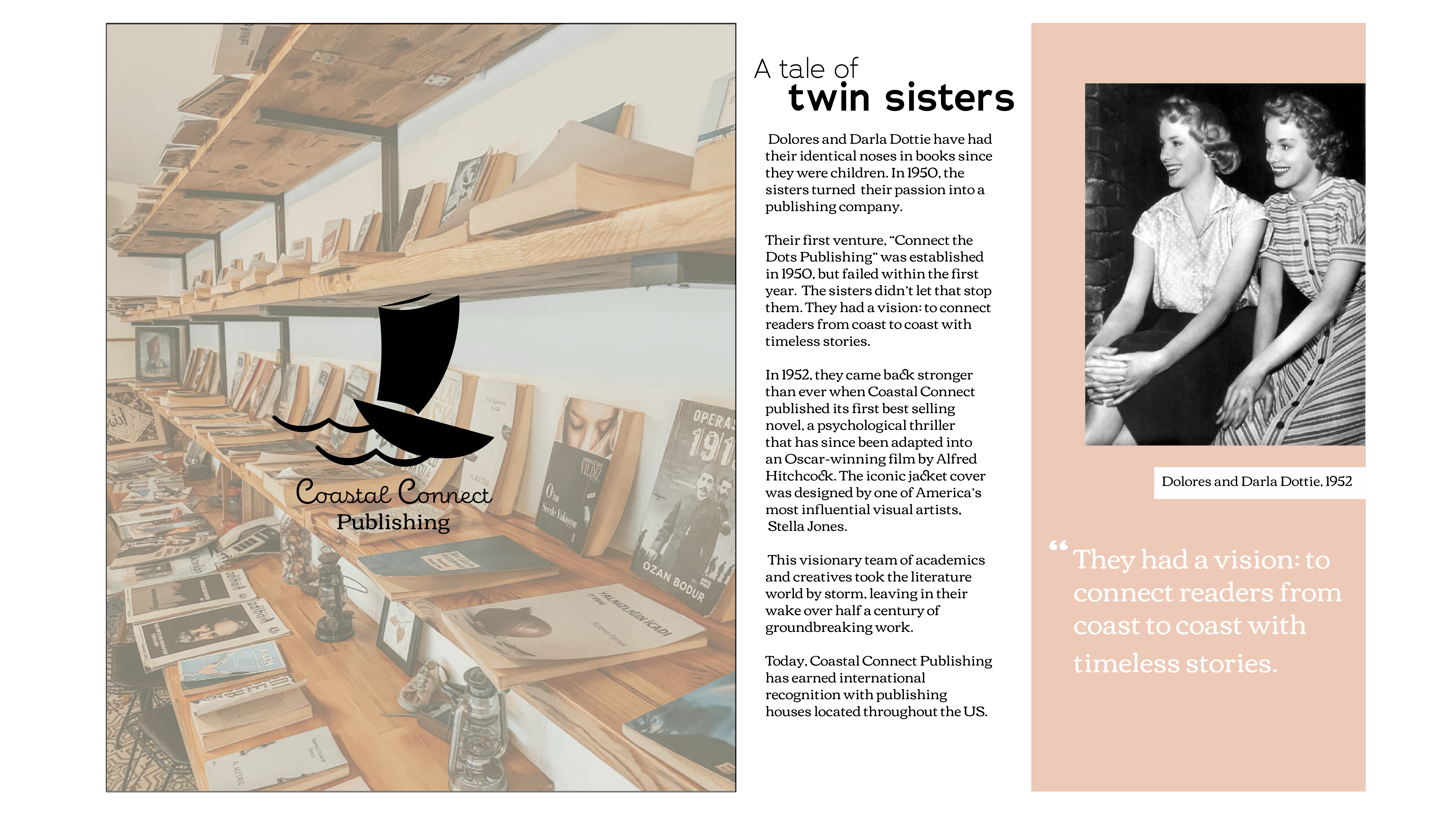
For the Twin Identities project, I was tasked with creating two separate brands based on one randomly chosen word. Additionally, each business needed a unique background story and mission statement. I was asked to choose two deliverables to design for each brand, keeping the deliverables the same throughout. My word was “connect”. Immediately, I started to think about what connects people. Stories and travel, I thought. Thus, I created Coastal Connect Publishing and Coastal Connect Motels.
Coastal Connect Publishing
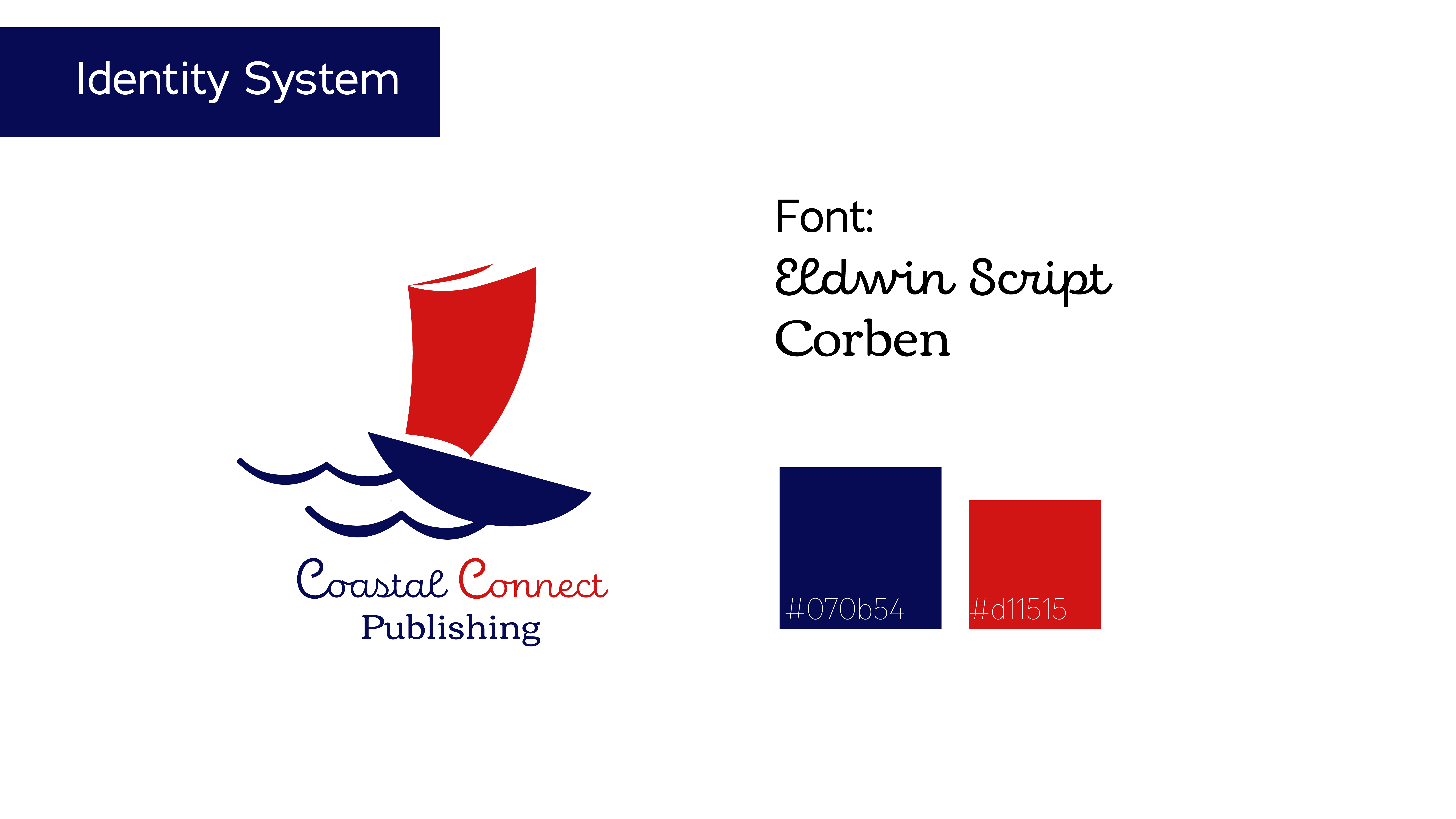
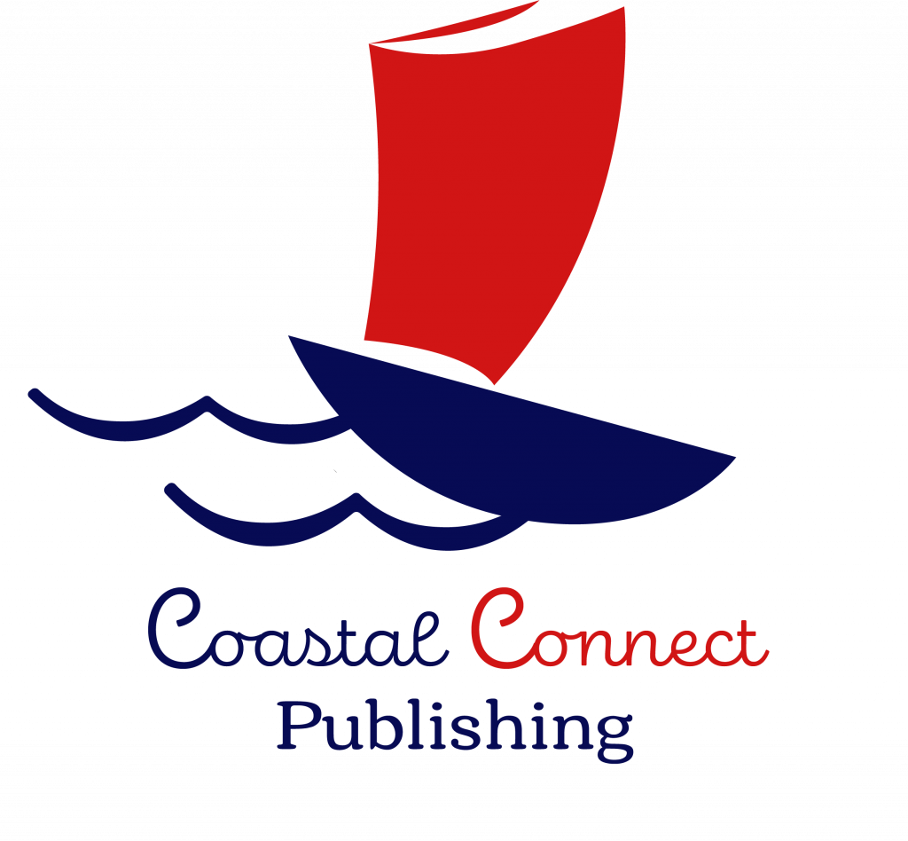
Keeping with the coastal, sea-faring theme, I chose a color palette of navy blue and red. Blue is meant to represent the reader’s vigilance while red represents their passion for reading. The logo, a boat setting sail for uncharted waters, is meant to symbolize discovery and adventure.
Coastal Connect Motel
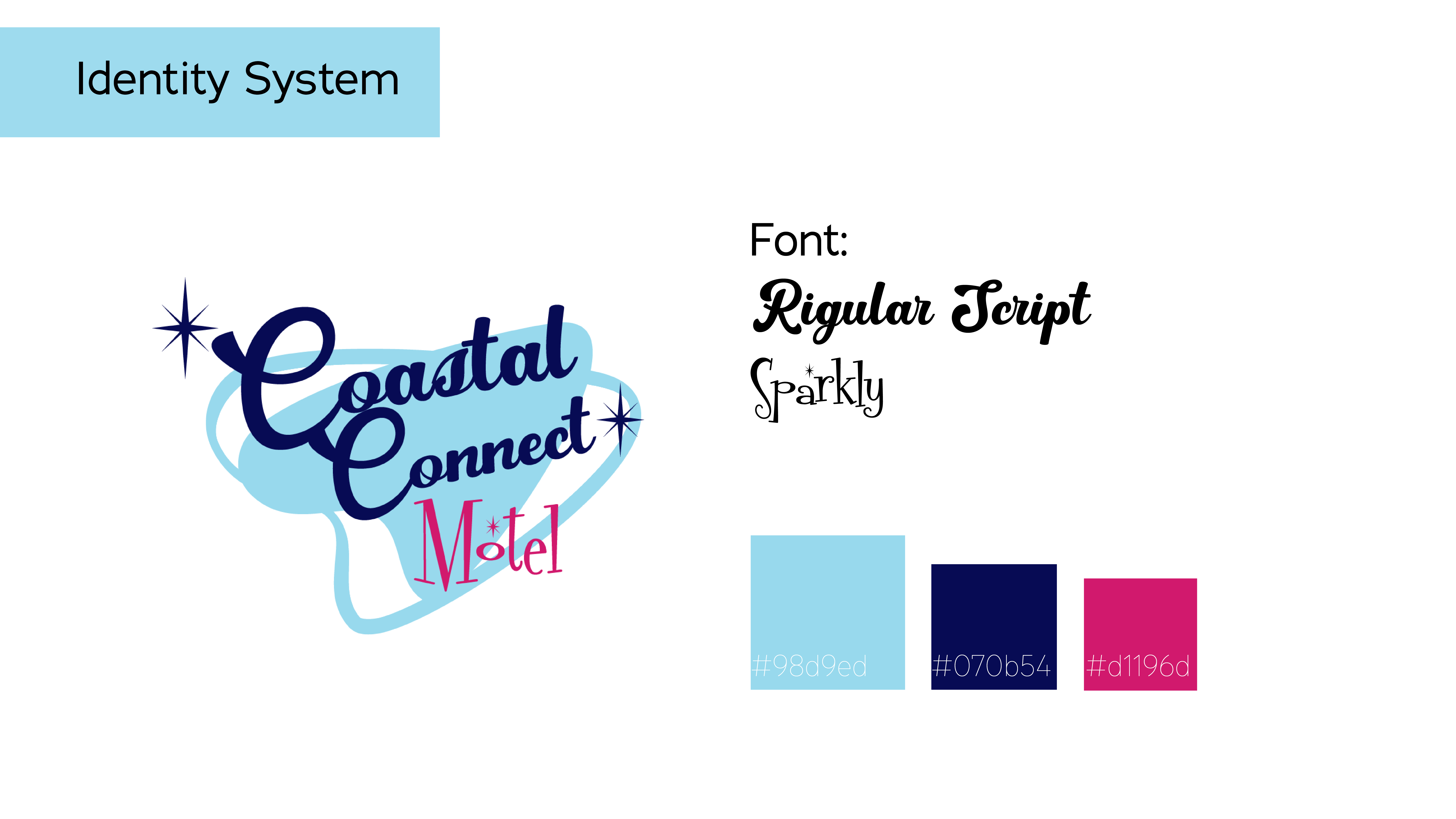
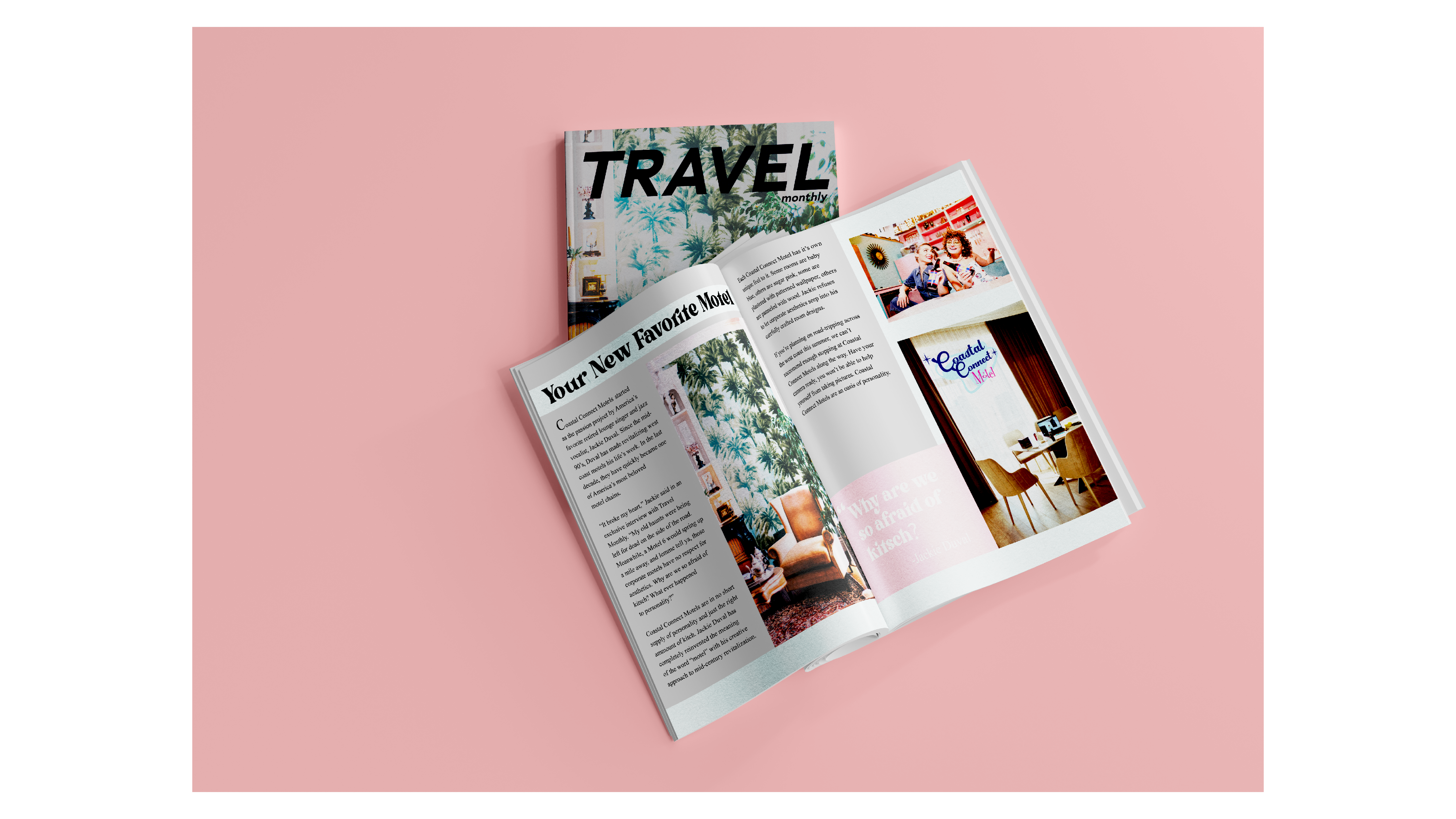
Coastal Connect Motel’s visual identity was inspired by Mid-Century American design. The motel’s background story involves a retired jazz singer who revitalizes run-down motels on the west coast. The logo and color palette embodies the brand’s history as well as its aesthetics.
